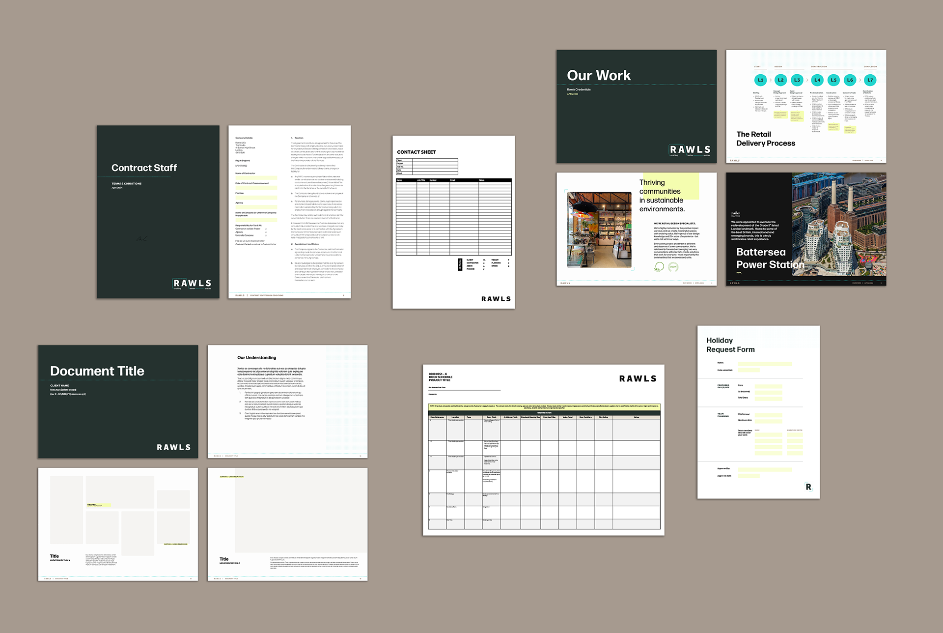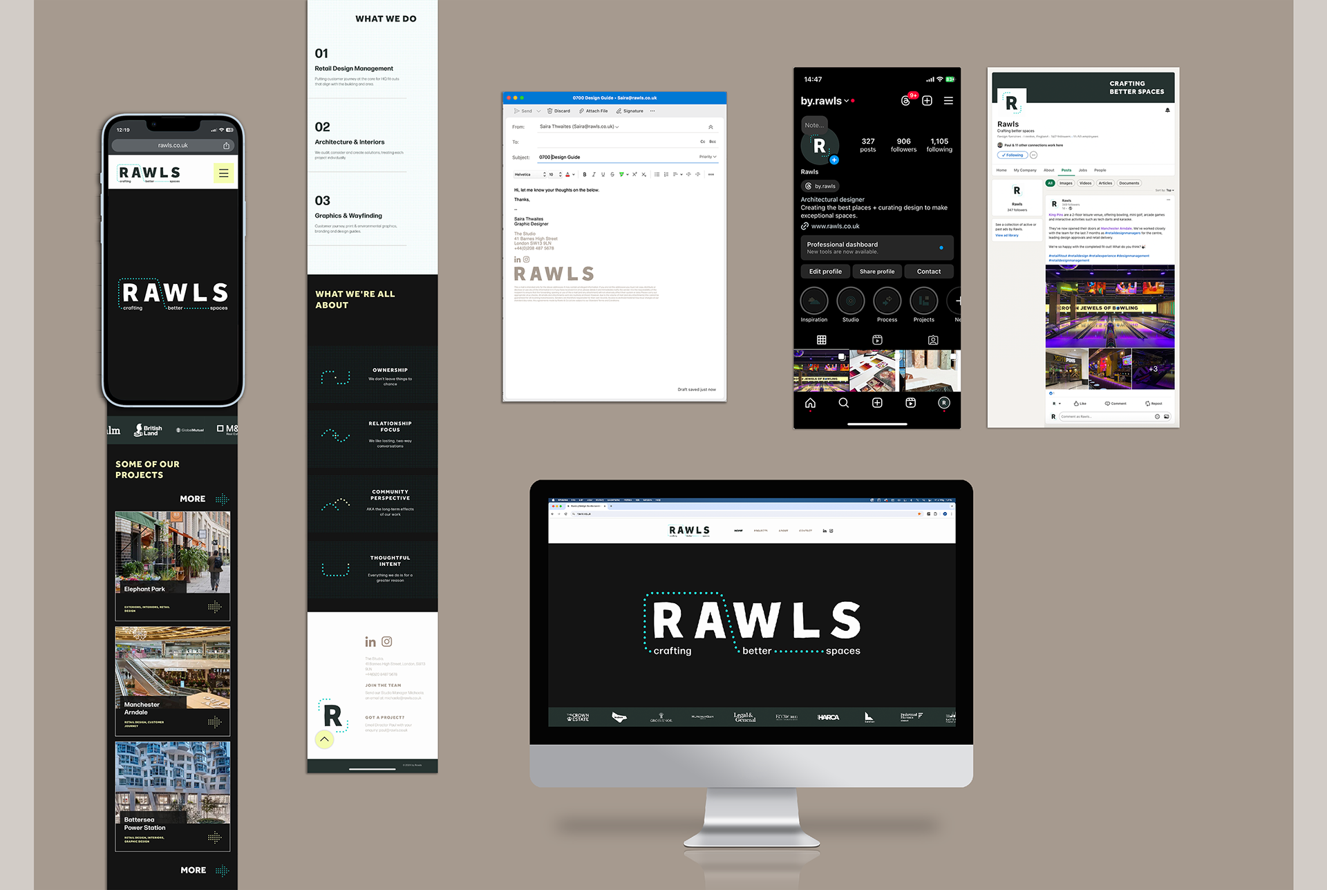


Rawls is a design studio based in Barnes, London. They specialise in retail design and fit out, as well as architectural solutions for developments such as Battersea Power Station, Elephant Park and Heathrow Airport. It became apparent that Rawls’ visual identity was becoming less and less aligned with its values and success, so I was brought on in September ’23 to rebrand the company.
I firstly looked at the existing brand, including strengths, weaknesses and USPs. I weighed up how much, if at all, this was being reflected in the current visual identity. By this I mean the logo, colours, type, plus socials/website. I quickly realised that there was a lot of work to do - the last rebrand was back in 2013. Rawls had had another ten years of experience under it’s belt and was a real market leader, which needed to be conveyed better, both in its core and visual identity.
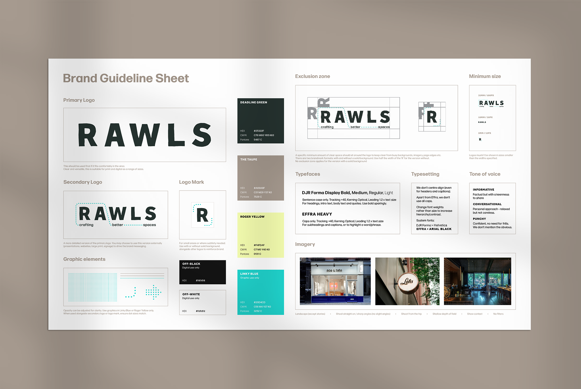
Before I could think about visuals, I defined the brand essentials - mission, vision, purpose, values, tone of voice, personality. The company name was to remain, but I dropped the ‘& co.’ to modernise it and keep concise. The tagline, previously ‘it’s only solved by design’ was replaced by the more purpose-driven ‘crafting better spaces’.
Logos - Idea Generation
Logos - Final Versions
Colours
Typefaces
Logos
Idea Generation
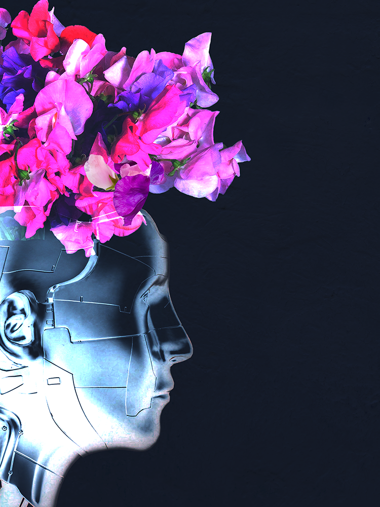
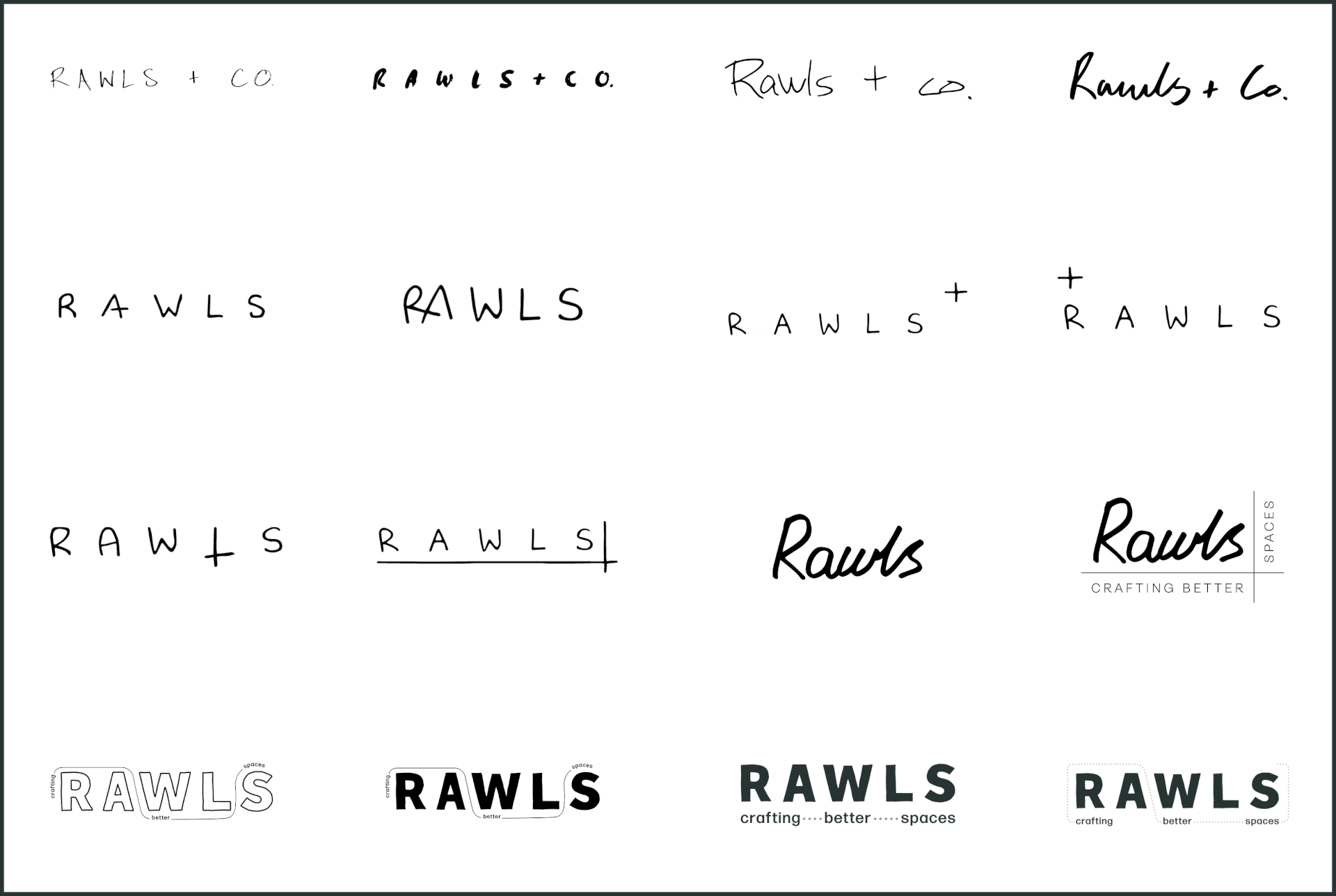
I first experimented with incorporating a plus sign, as it suggests added value, premium, relationship-led, plus it added graphical interest. I then wondered how to show that Rawls create spaces, so introduced grids to the logo. I looked at purely handwritten logos, but these ended up being slightly too bespoke and hard to read.
I first experimented with incorporating a plus sign, as it suggests added value, premium, relationship-led, plus it added graphical interest. I then wondered how to show that Rawls create spaces, so introduced grids to the logo. I looked at purely handwritten logos, but these ended up being slightly too bespoke and hard to read.
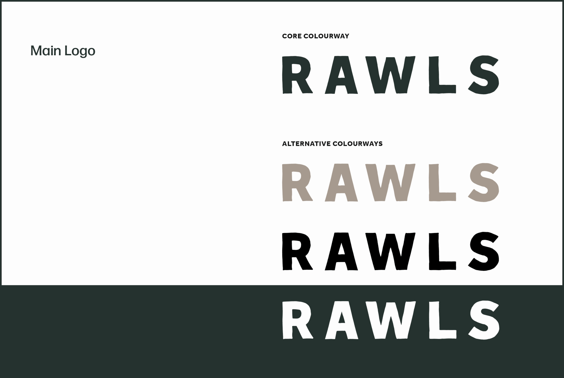
I was eventually attracted to the clean lines and open proportions of Effra Heavy. I printed and traced it by hand to inject some character, and the stamp-like result conveyed an authority that was missing before.
Final Versions
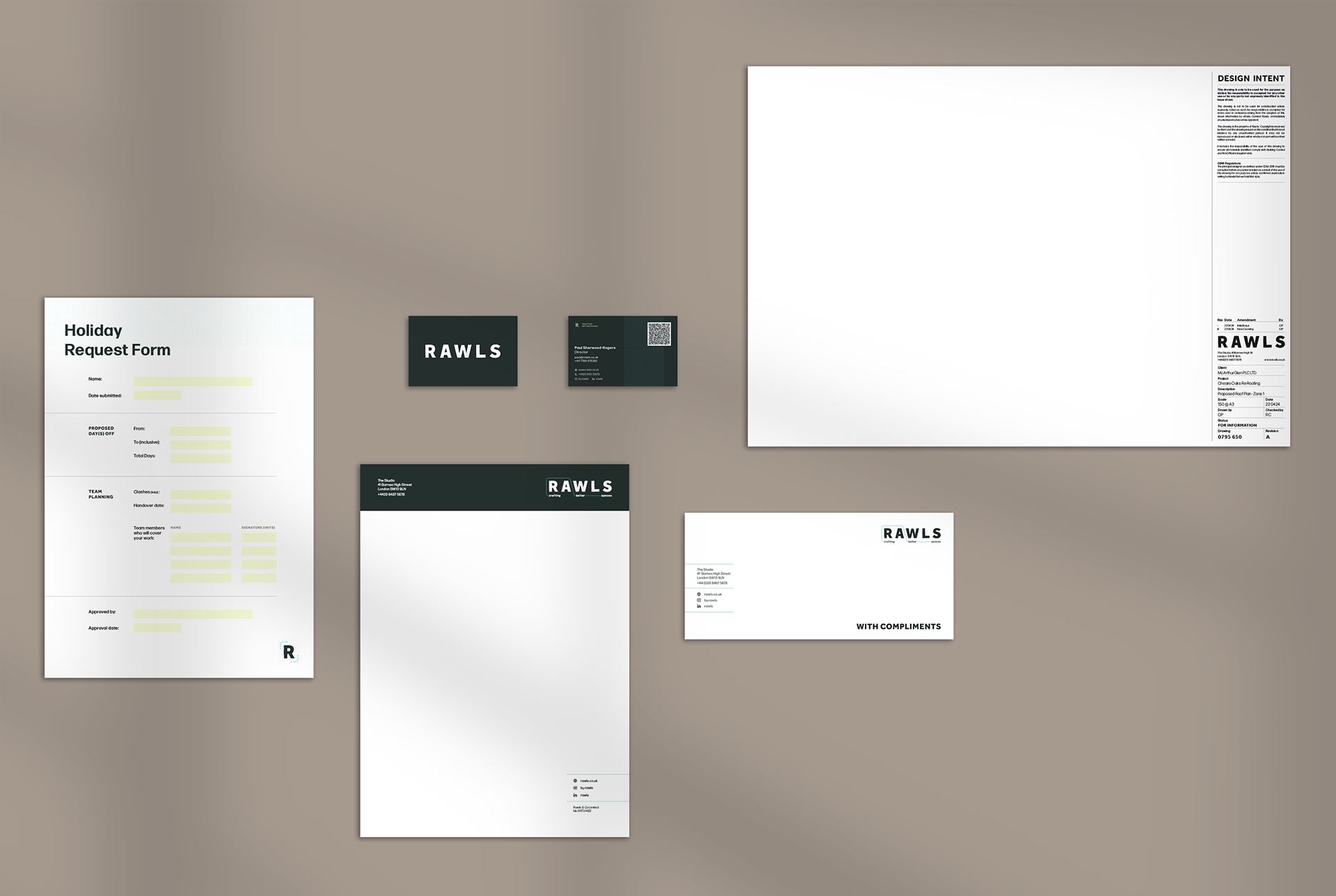
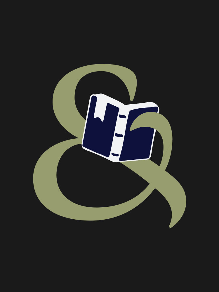
The secondary logo features the tagline, which wraps around letters using a dotted line to convey movement - while remaining open. This is for more formal external comms, where the brand messaging needs emphasising. The brandmark is for smaller spaces. There are two versions - with and without a solid background.
The secondary logo features the tagline, which wraps around letters using a dotted line to convey movement - while remaining open. This is for more formal external comms, where the brand messaging needs emphasising. The brandmark is for smaller spaces. There are two versions - with and without a solid background.
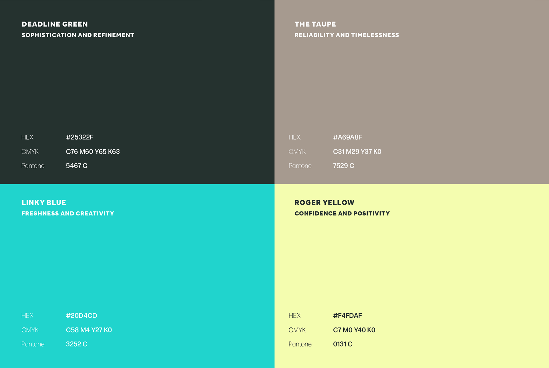
Colours
Four colours were introduced to give the brand some life - the sophisticated ‘Deadline Green’, the timeless ‘The Taupe’, the confident ‘Roger Yellow’ and the fresh ‘Links Blue’. For digital, off-black and off-white were the new black and white for legibility reasons.
Typefaces
Effra Heavy was reintroduced for the brand typefaces, to be used for accents and captions (in caps only). The core font is Forma DJR Display - clean and characterful.