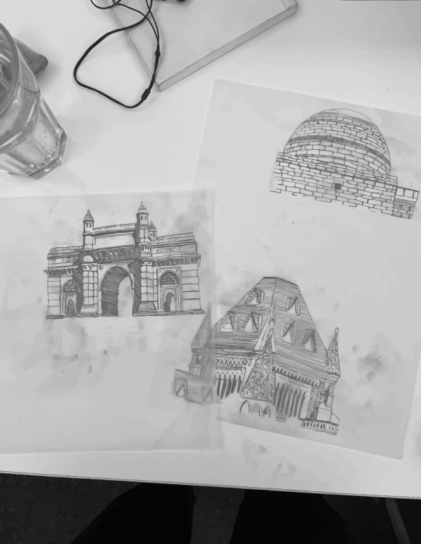
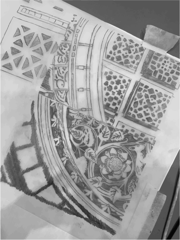
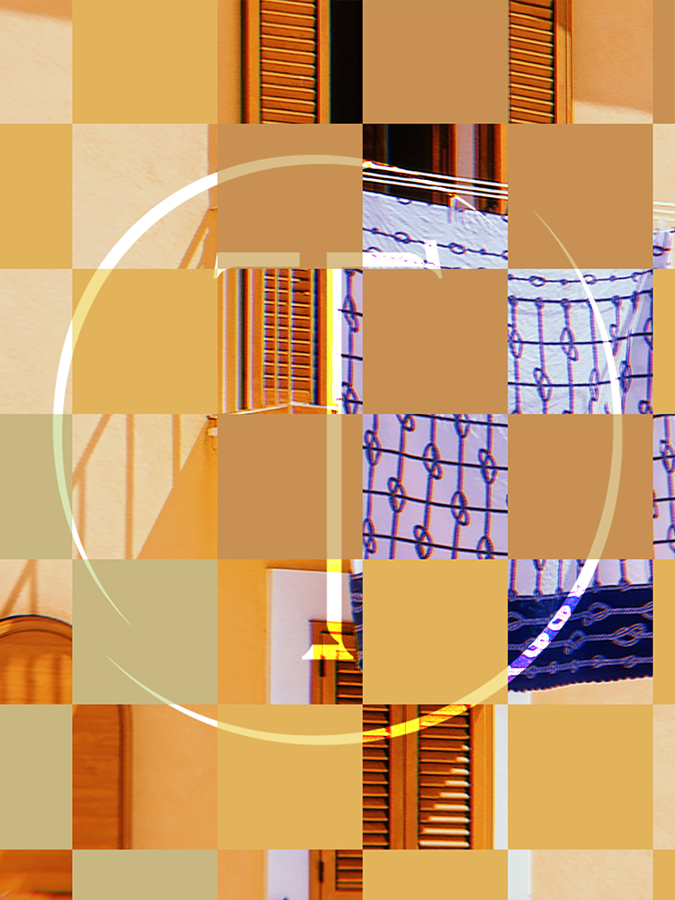
This client is an organiser of annual architectural tours around the world’s best and most interesting buildings. They needed a brochure designed for attendees of an upcoming weekend event around the historical monuments of Mumbai, India. The visual identity takes inspiration from the textures in the buildings of Mumbai and the differences in architectural styles left over from the colonial era.

Process
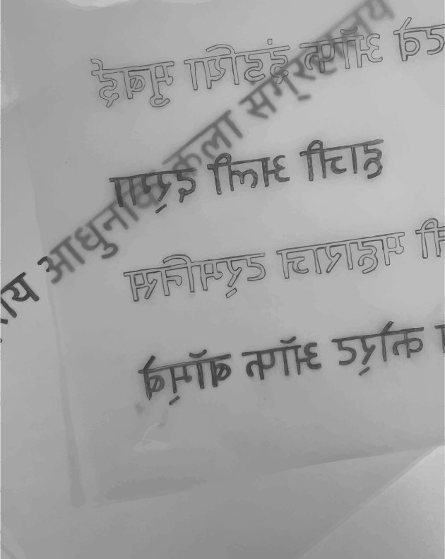
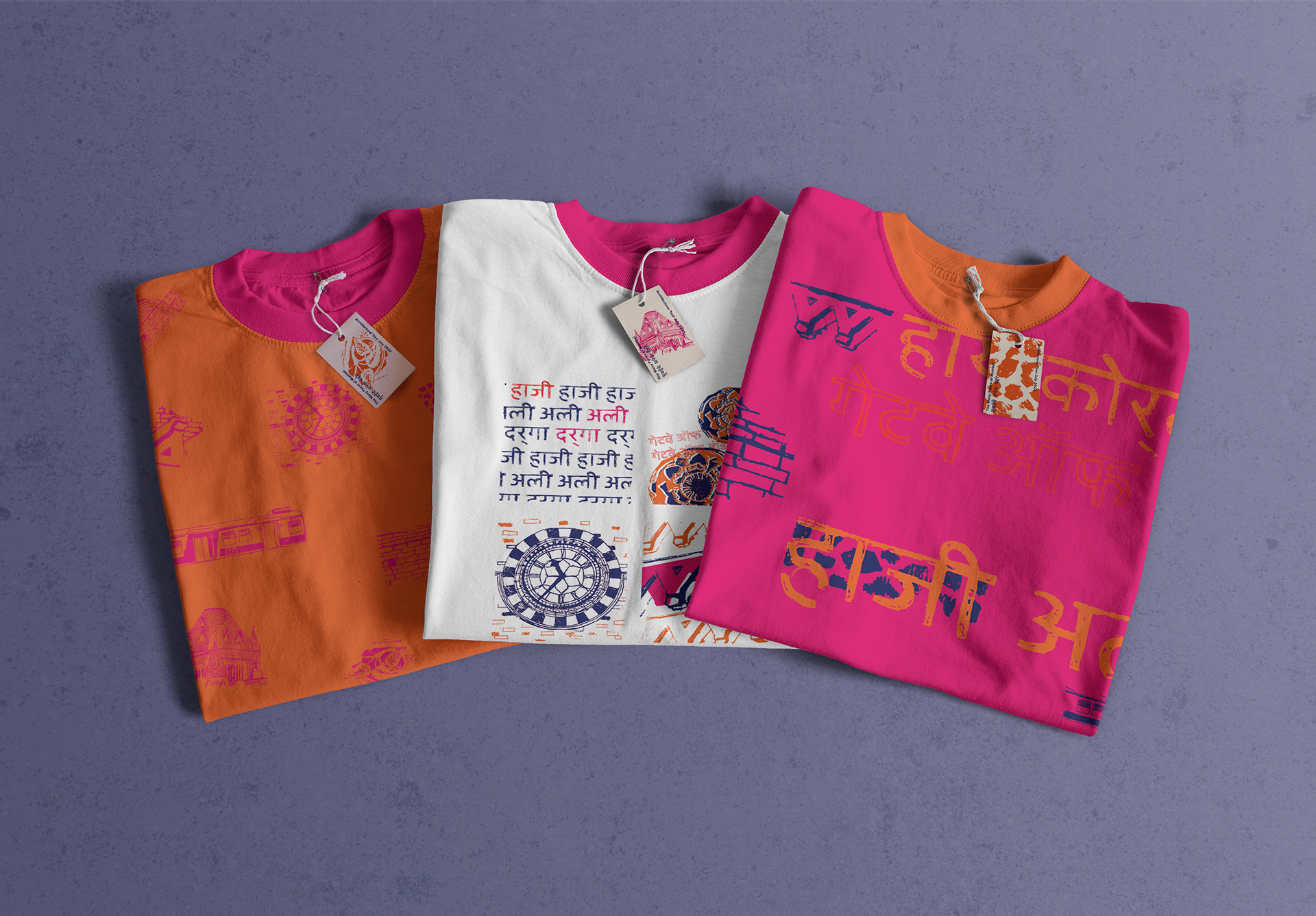
I was very keen to convey the mixture of different architectural styles in Mumbai - as well as the hustle and bustle of the city. With 'texture' being one of my keywords, I looked at the tour's buildings - as well as the names of the landmarks in Mahrati - traced them by hand and collaged them to create an overlapping effect.
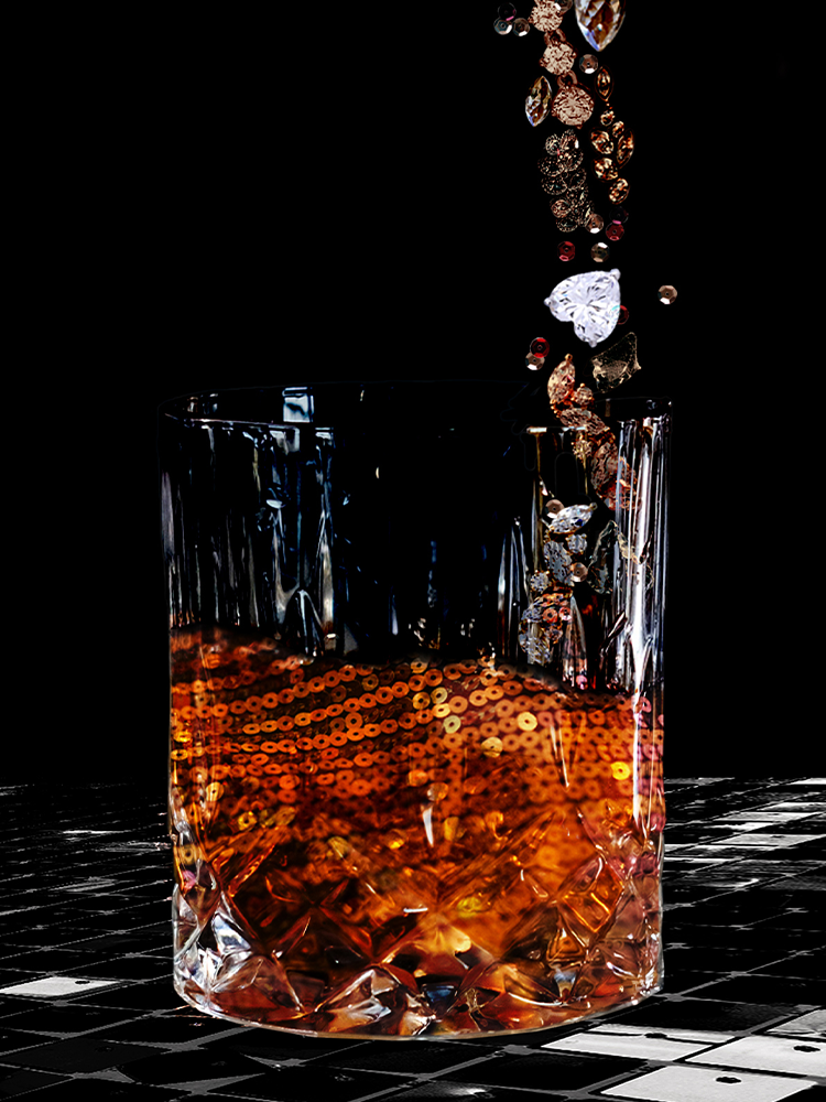
Saffron is the sacred colour of India - which I darkened slightly to make more striking, and paired with analogous colours to drive this feeling of chaos. I chose complementary colour blue to cut through the noise where needed.
This is student work.
