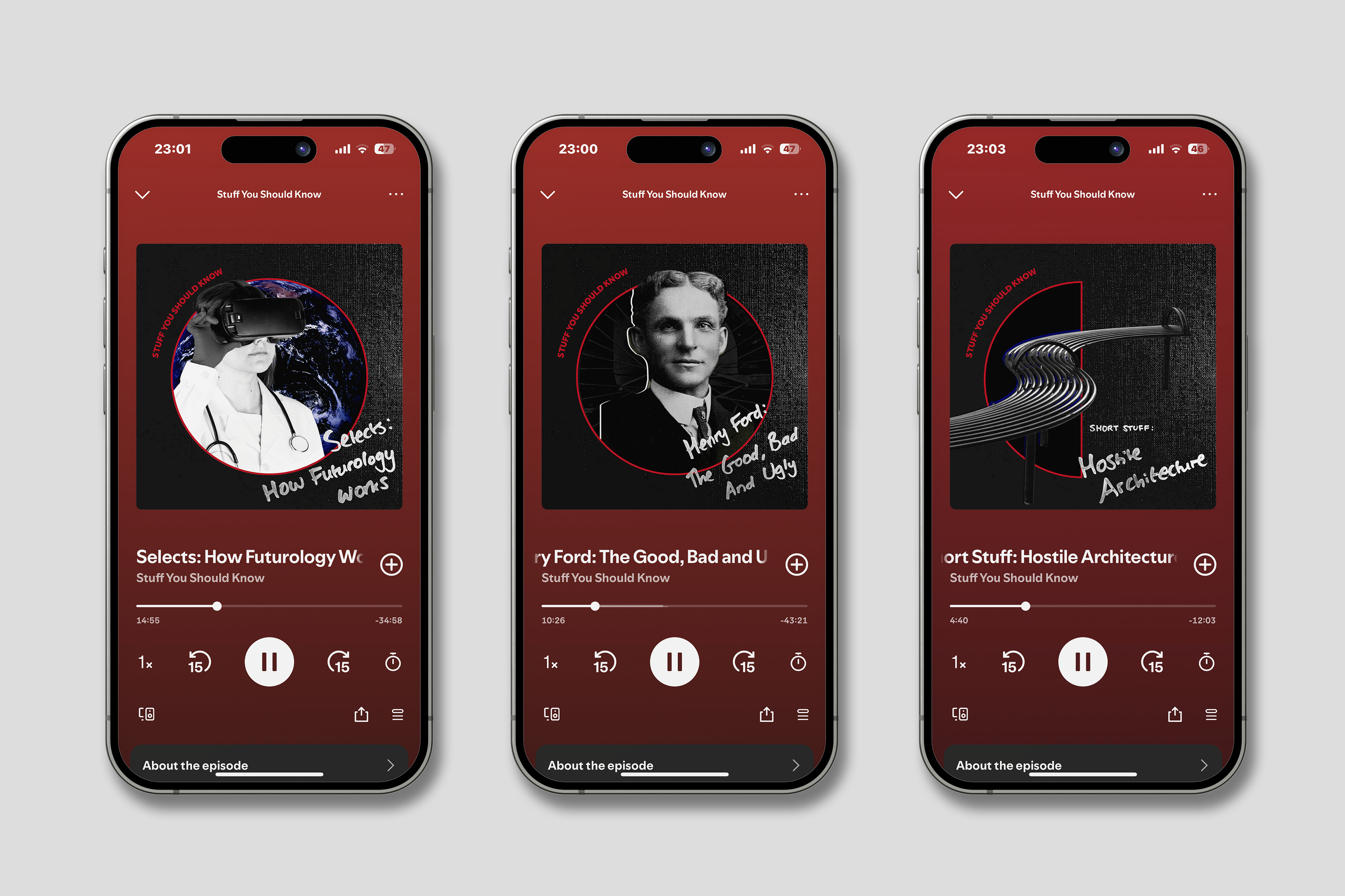
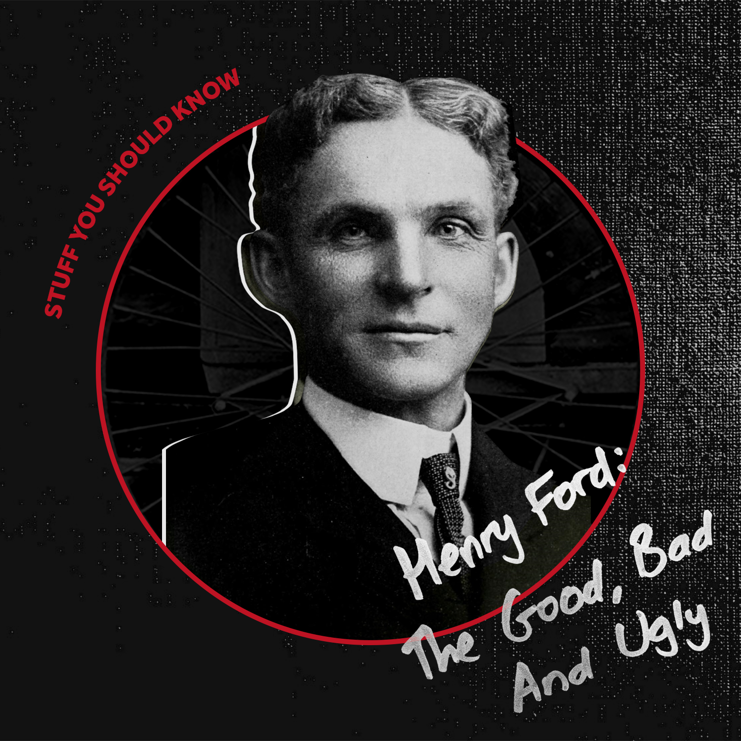
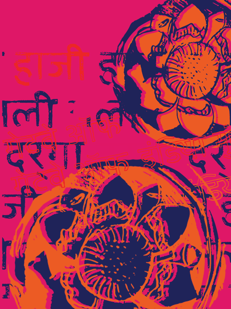
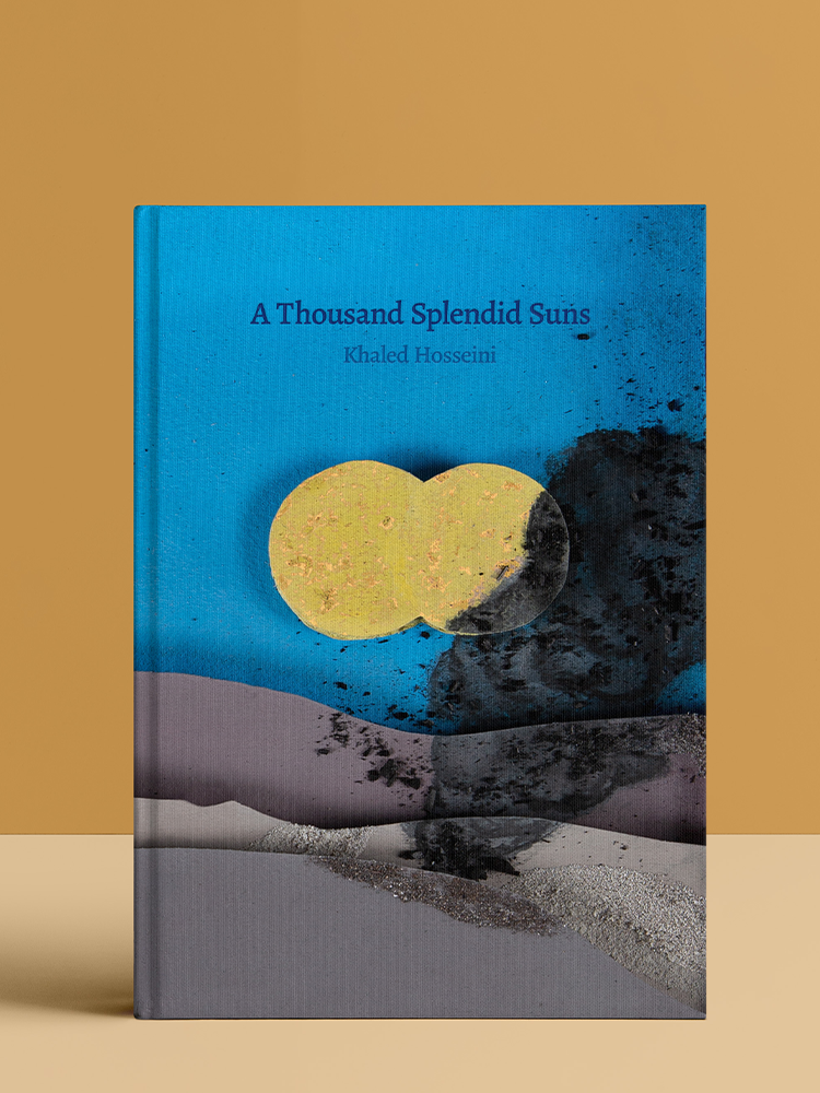
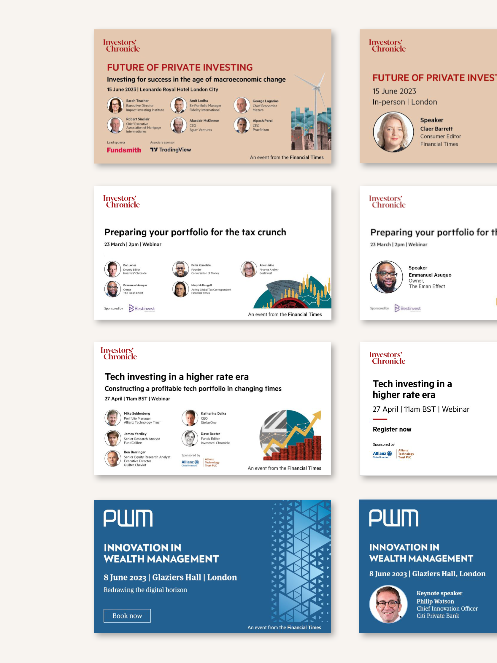
I'm a long-term fan of this popular podcast, where the two hosts do a deep dive into a specialist subject every week. I always thought the current artwork was slightly bare - not doing the podcast justice at all - so I decided to redo it. I kept the podcast's signature red colour and sans serif typography but added texture and layered, mostly black and white imagery in the main image. The handwritten titles also reflect the character of the hosts, and create an engaging feel.
The depth of each episode is conveyed better now, and listeners will now have more context before pressing play.
