

This was a personal rebranding project for Moroccan extra virgin olive oil brand, Morocco Gold. The brand's values are Heritage & Source, Provenance & Authenticity, Taste, Health & Wellness and Community. I wanted to create a new identity that better reflected these values, which was then rolled out into the website.
Visual Identity
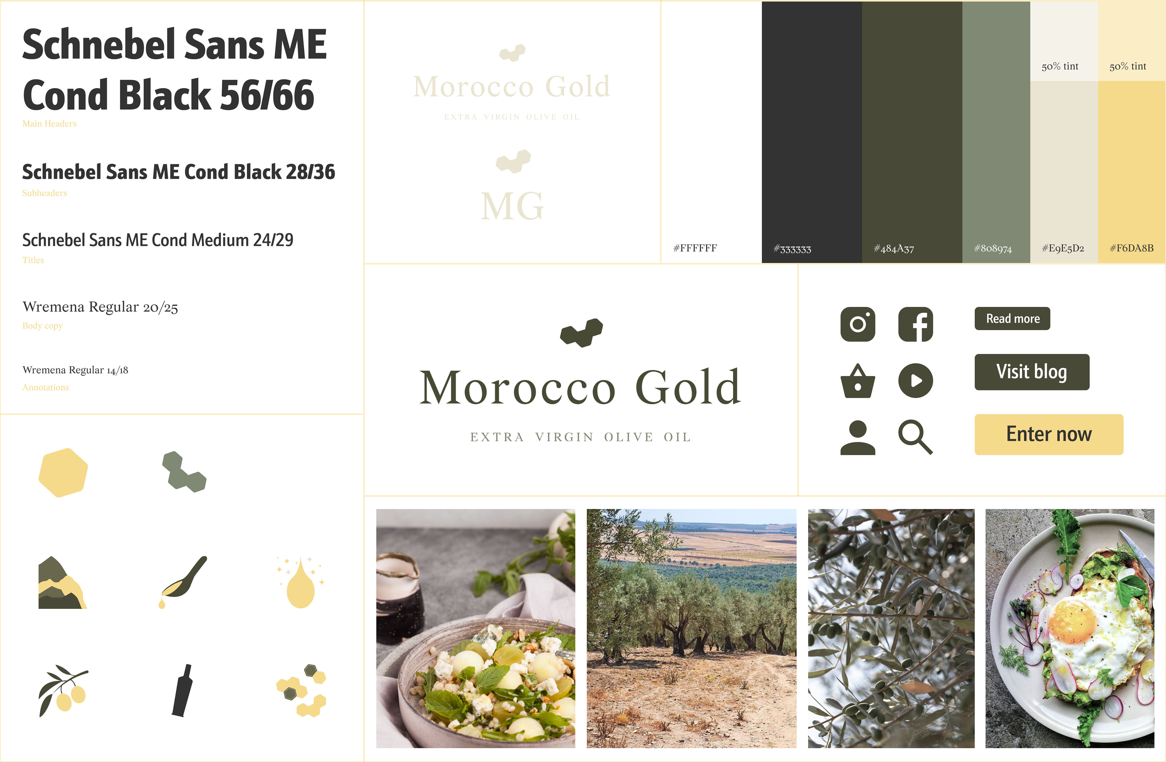
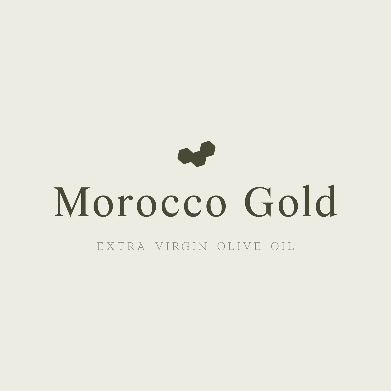
Morocco Gold's current logo uses an outdated, generic typeface which is hard to read. The sharp, triangular serifs in Wremena create a sense of class and timelessness, especially alongside secondary typeface, Schnebel Sans ME Condensed.
One of the oil's main USPs is it's high level of health-enhancing polyphenols, and the hexagon element nods to their chemical structure. This is a highly authentic brand, so I kept the colour palette neutral with greens, with the yellow providing some much-needed contrast.
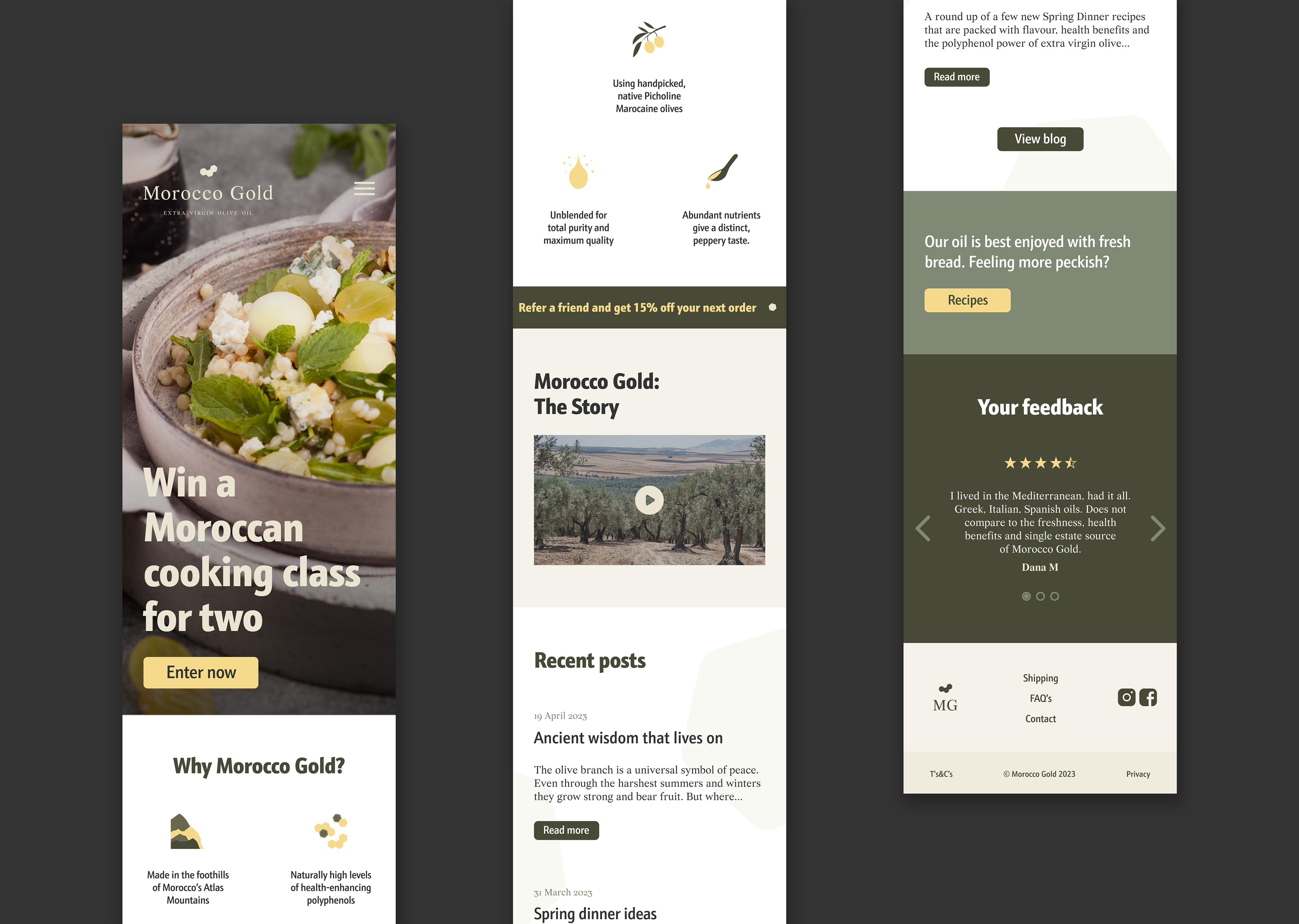
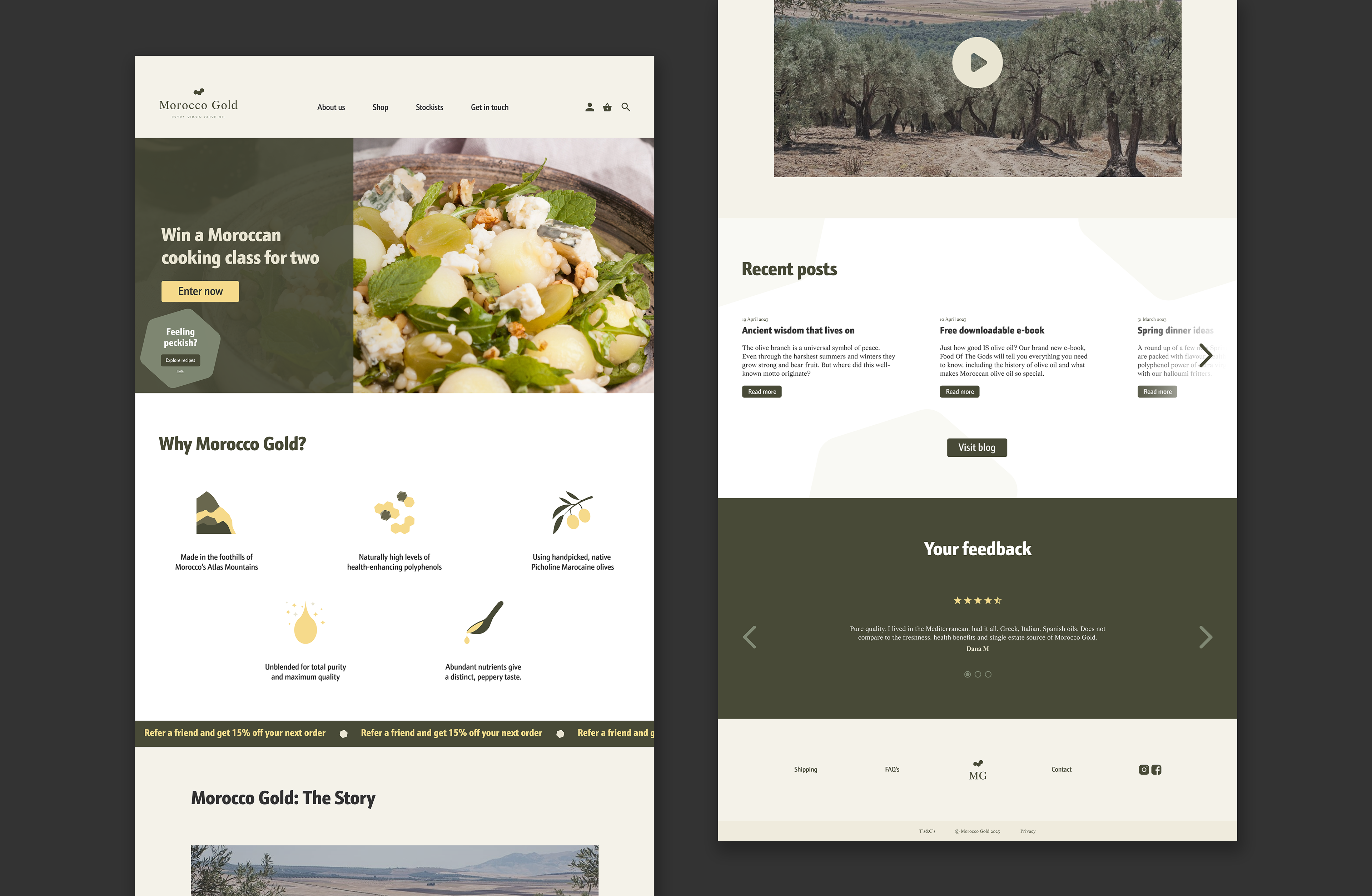
The company's website is cluttered and repetitive, making for a overwhelming and confusing user experience. The new, punchier visual identity allows for a clearer hierarchy, more digestible information and better mobile experience.