

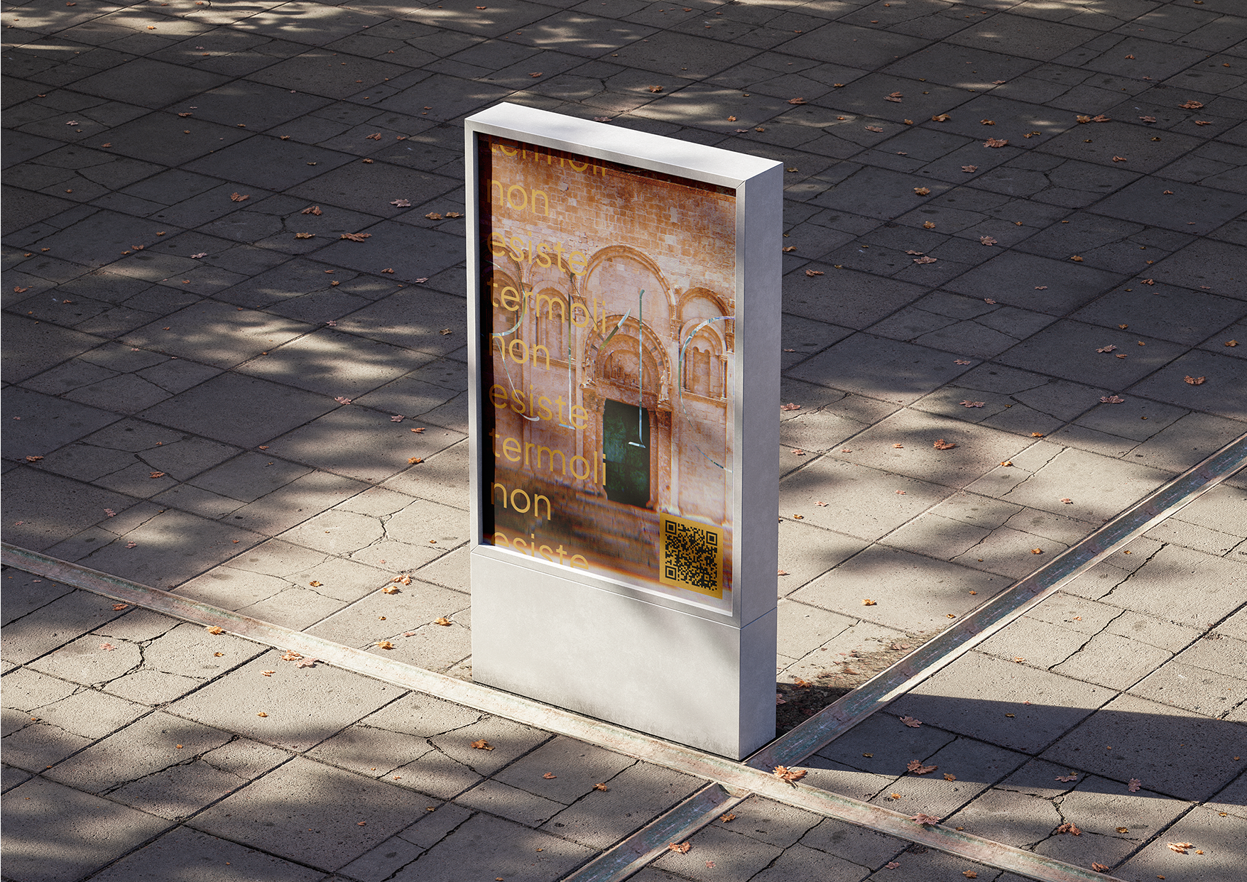
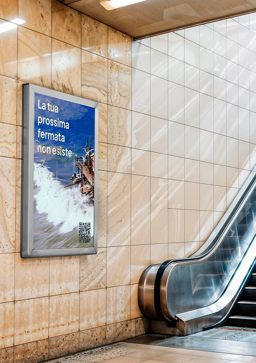
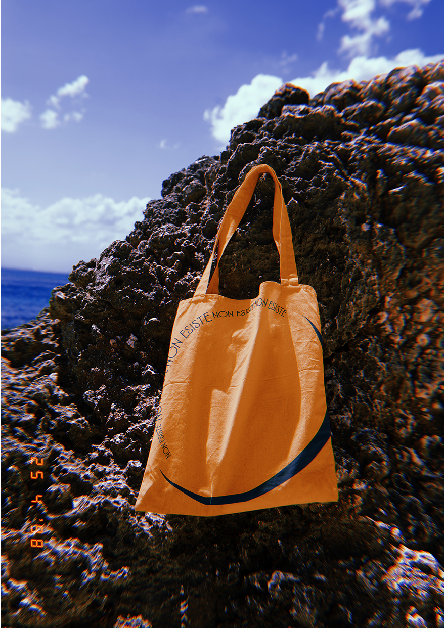
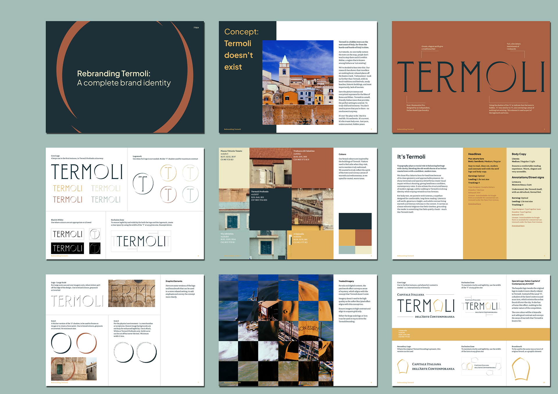
This was a competition held by Terraviva, asking for pitches to rebrand the quaint Italian seaside town of Termoli, to boost public awareness and therefore tourism. The town is located within the Molise region, which is known amongst Italians as 'not existing'. Our research found that travellers are seeking local, relaxed places off the beaten track. ‘Calmcations’. Termoli fits this perfectly, with it's authenticity, friendliness, local traditions, great beaches and chilled vibe. No need for bells and whistles. It's the truest Italy ever. Hidden. You won't find sparkling five star experiences, English menus or overpriced coffee. But you will find true peace - and emotional distance from your busy day-to-day life.
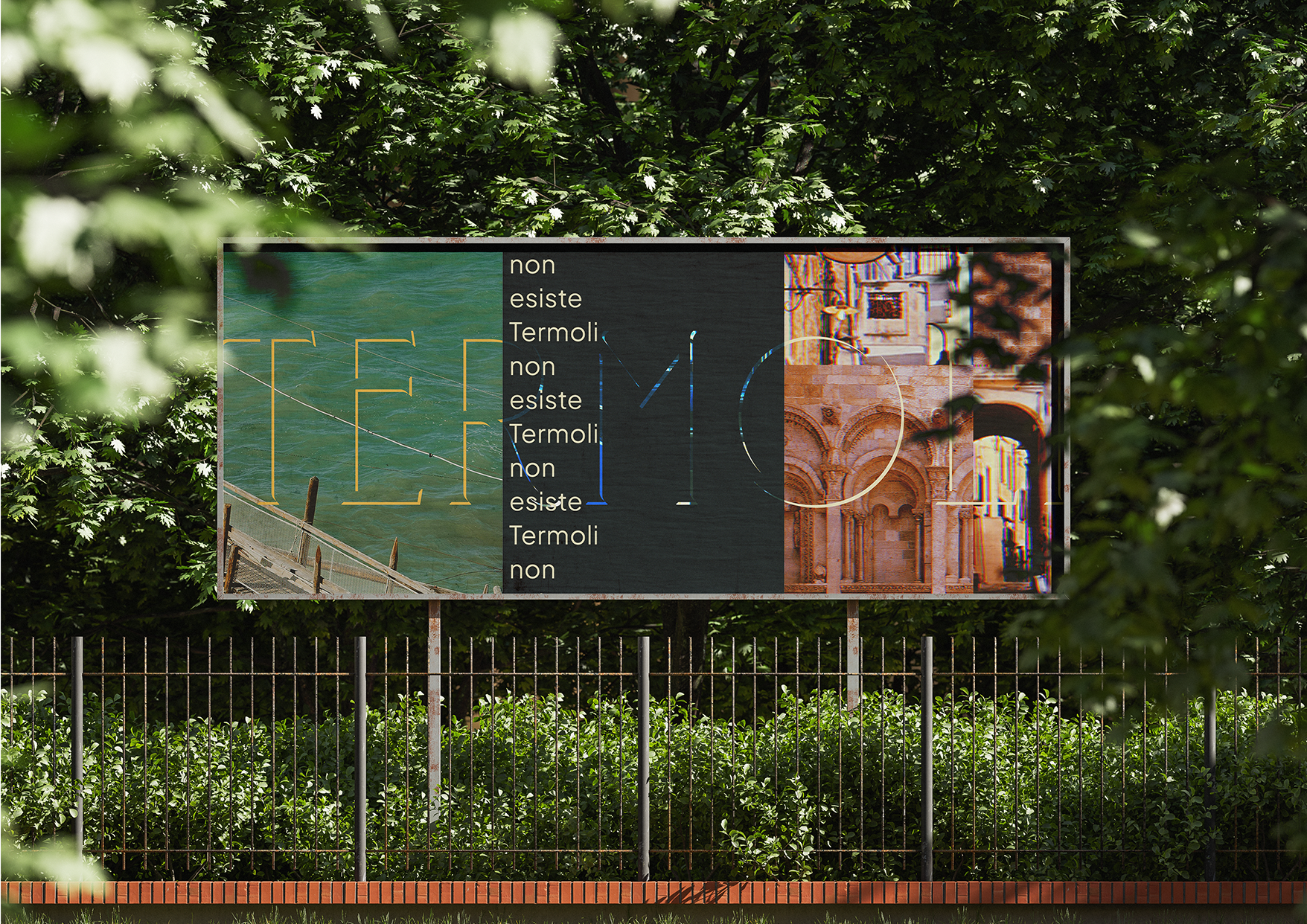
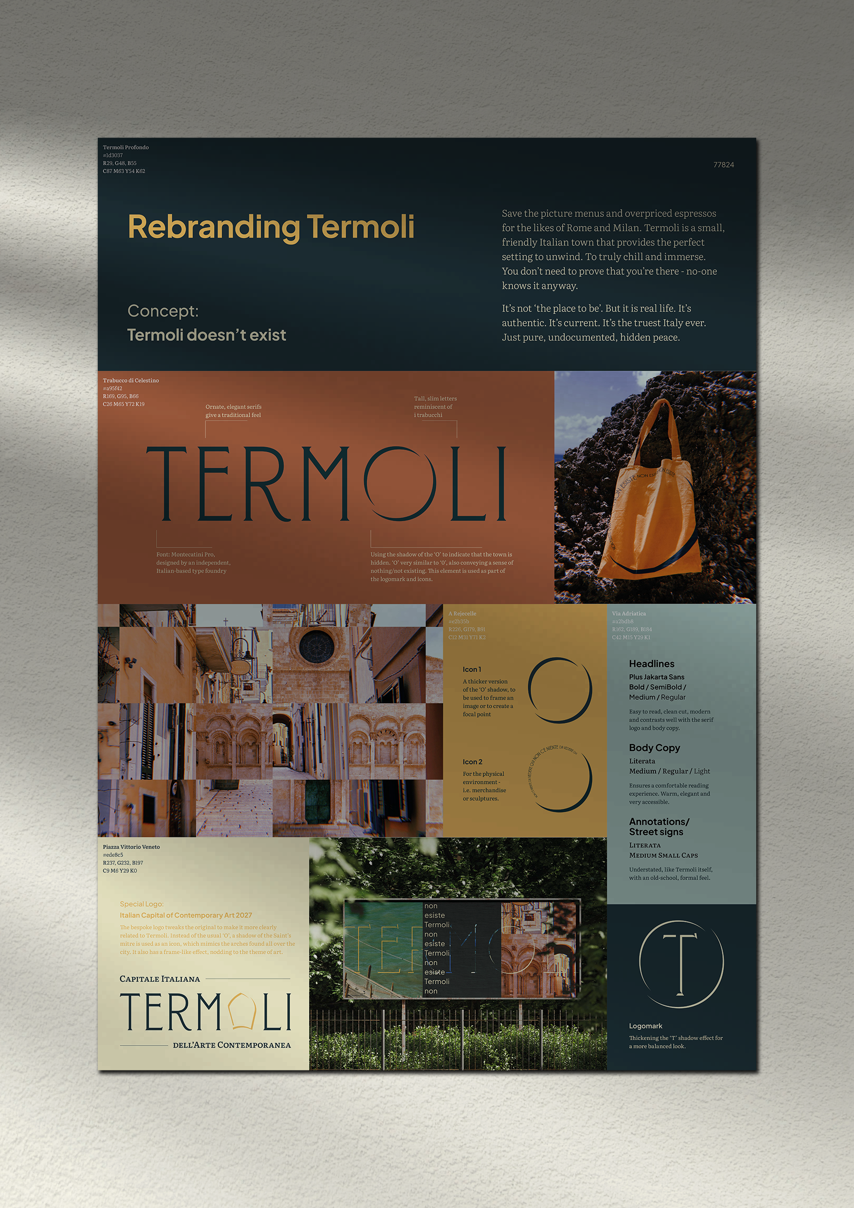
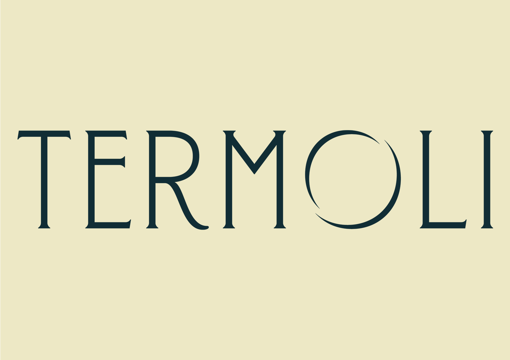
Logo - Tweaks Montecatini Pro, from Tipofili, an independent Italian- based type foundry. Ornate, elegant serifs give a traditional feel while the tall, slim letters are not dissimilar to i trabucchi - that wooden fishing structures that Termoli is known for. The shadow of the ‘O’ indicates that the town is hidden while nods to it's sunny climate.
Typography - Plus Jakarta Sans for headlines because of its clean geometry and approachable presence - it also echoes the structured beauty of modern signage around Termoli. Literata for body copy, a quietly classic typeface designed for comfortable, long-form reading.
Colours - Inspired by the buildings of Termoli. We wanted to convey a sense of warmth and welcomeness, so we went for muted, warm tones.
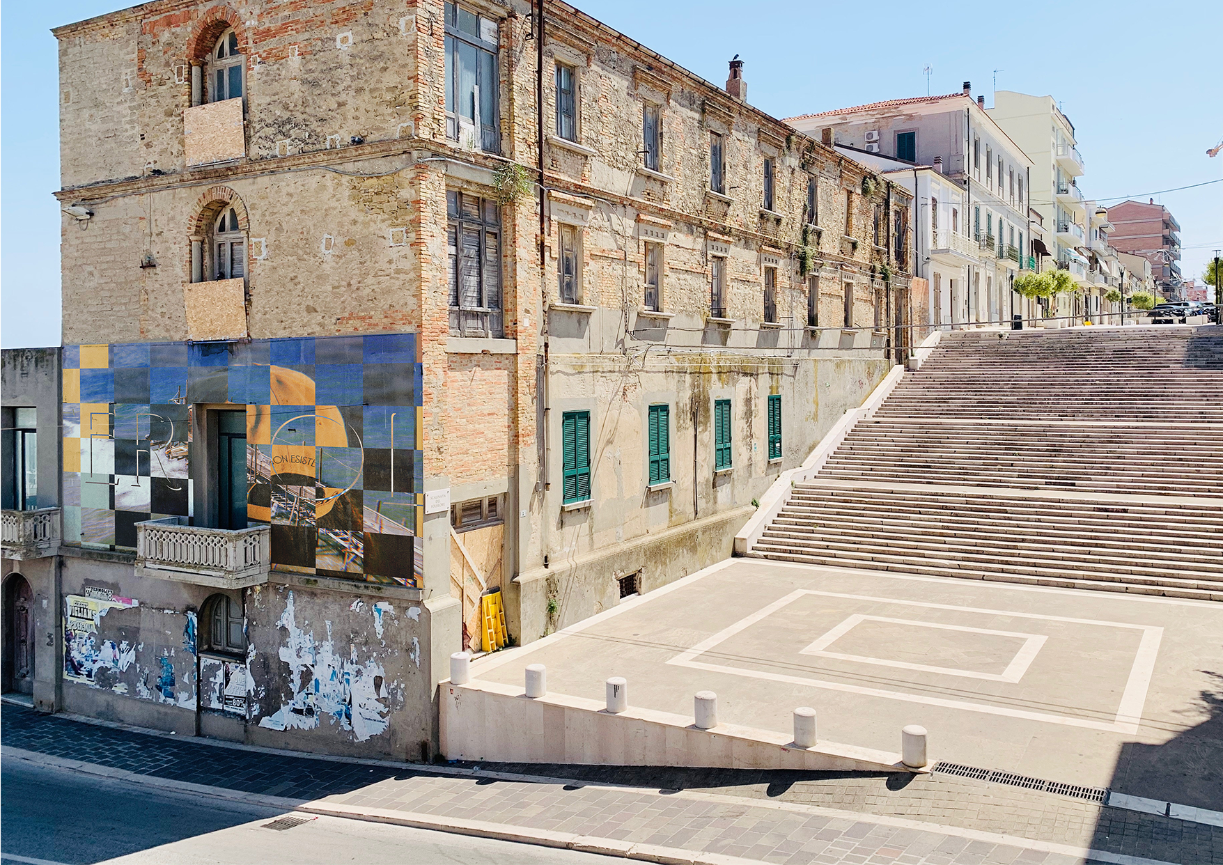
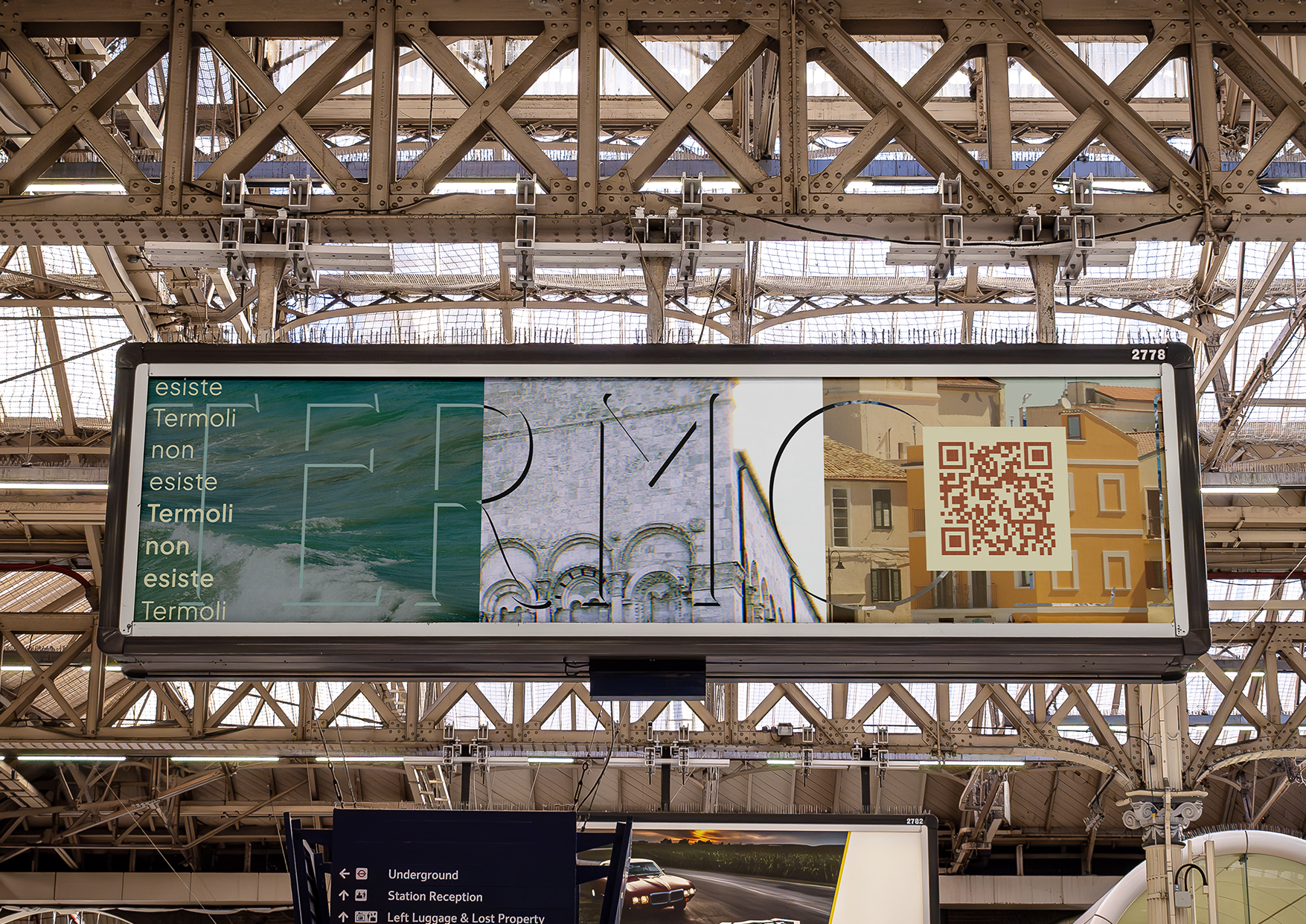
Imagery - Patchwork effect conveys a sense of mystery, which aligns with the concept 'Termoli doesn’t exist'. Both slight blur and high contrast give a classic, warm feel.

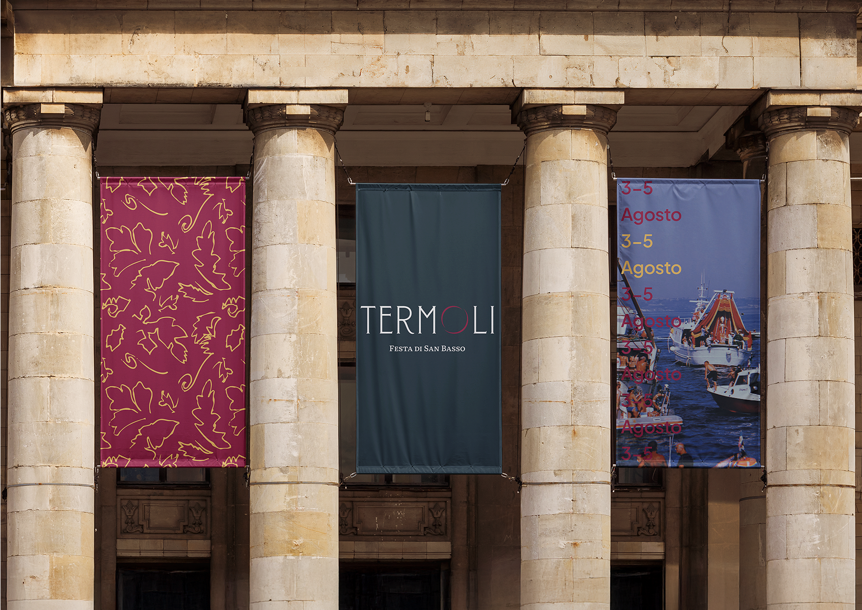
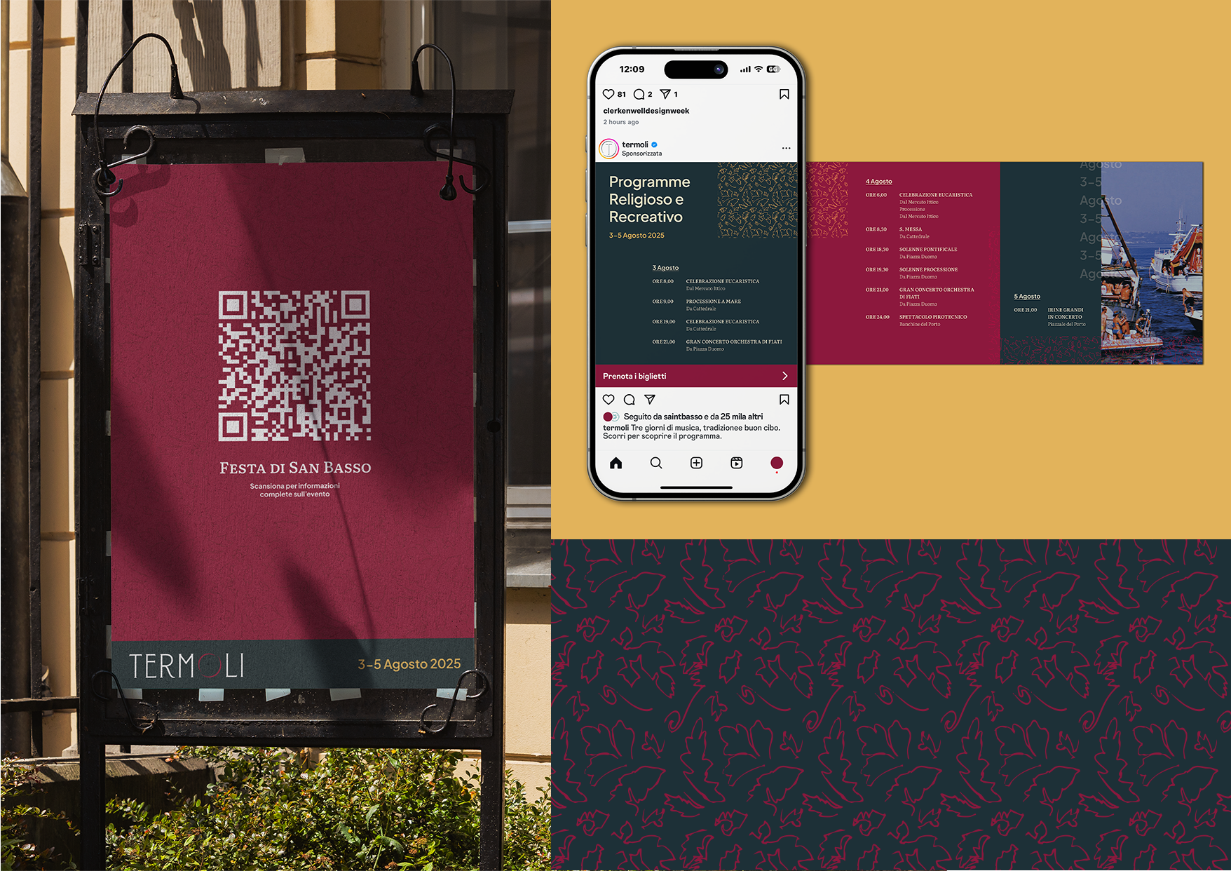
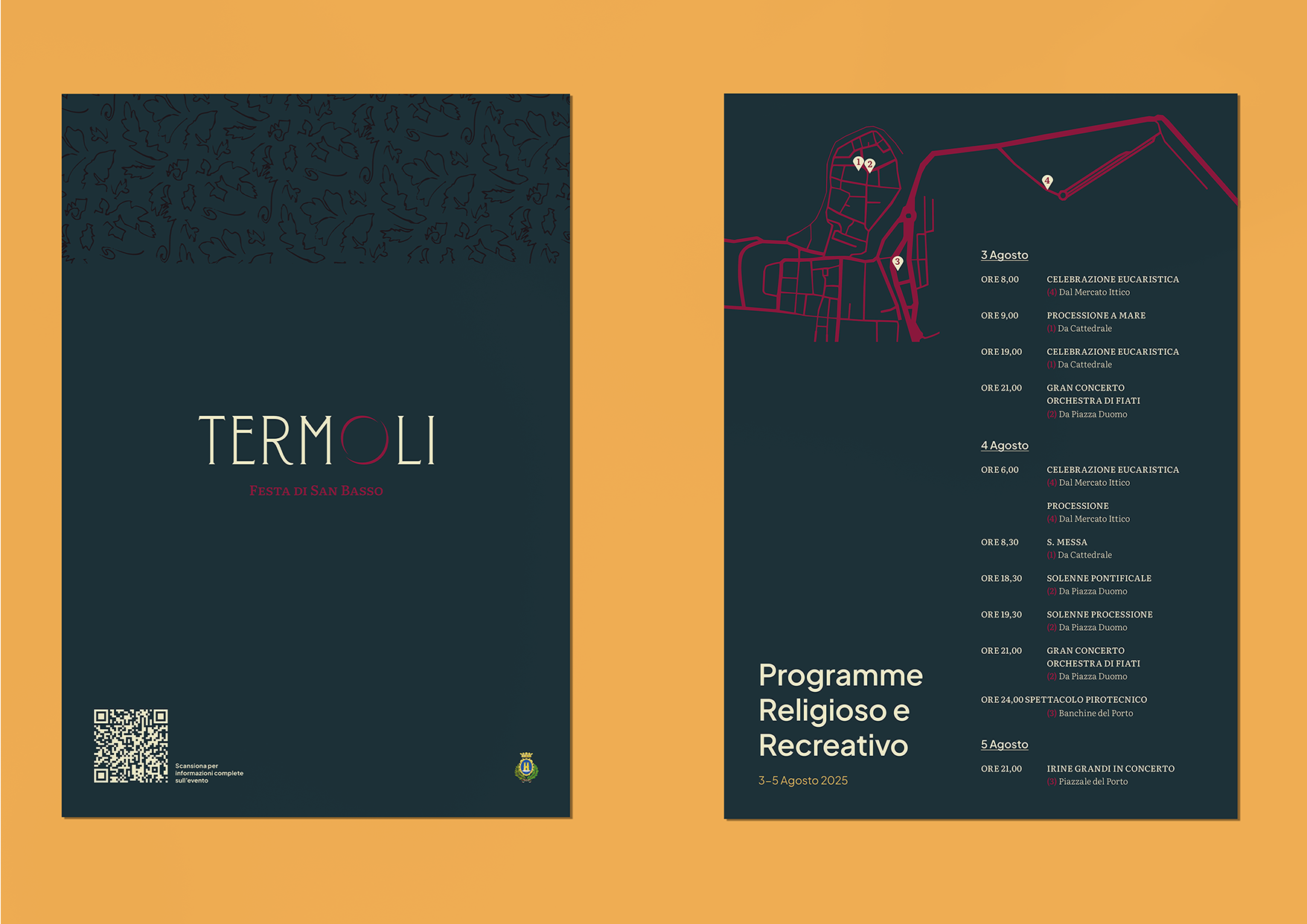
Sub-brand: Festa di San Basso
The town's Festa di San Basso, held annually in August, is a vibrant celebration honouring the town's patron saint, featuring a unique sea procession where the saint's statue is paraded on a fishing boat, accompanied by a fleet of vessels, music, and culminating in fireworks and festivities.
We wanted to show how the visual identity can be adapted for local events, in this case we add a deep red to the palette (taken from the saint's clothing) and introduce a floral pattern, inspired by the saint's decorative mitre.