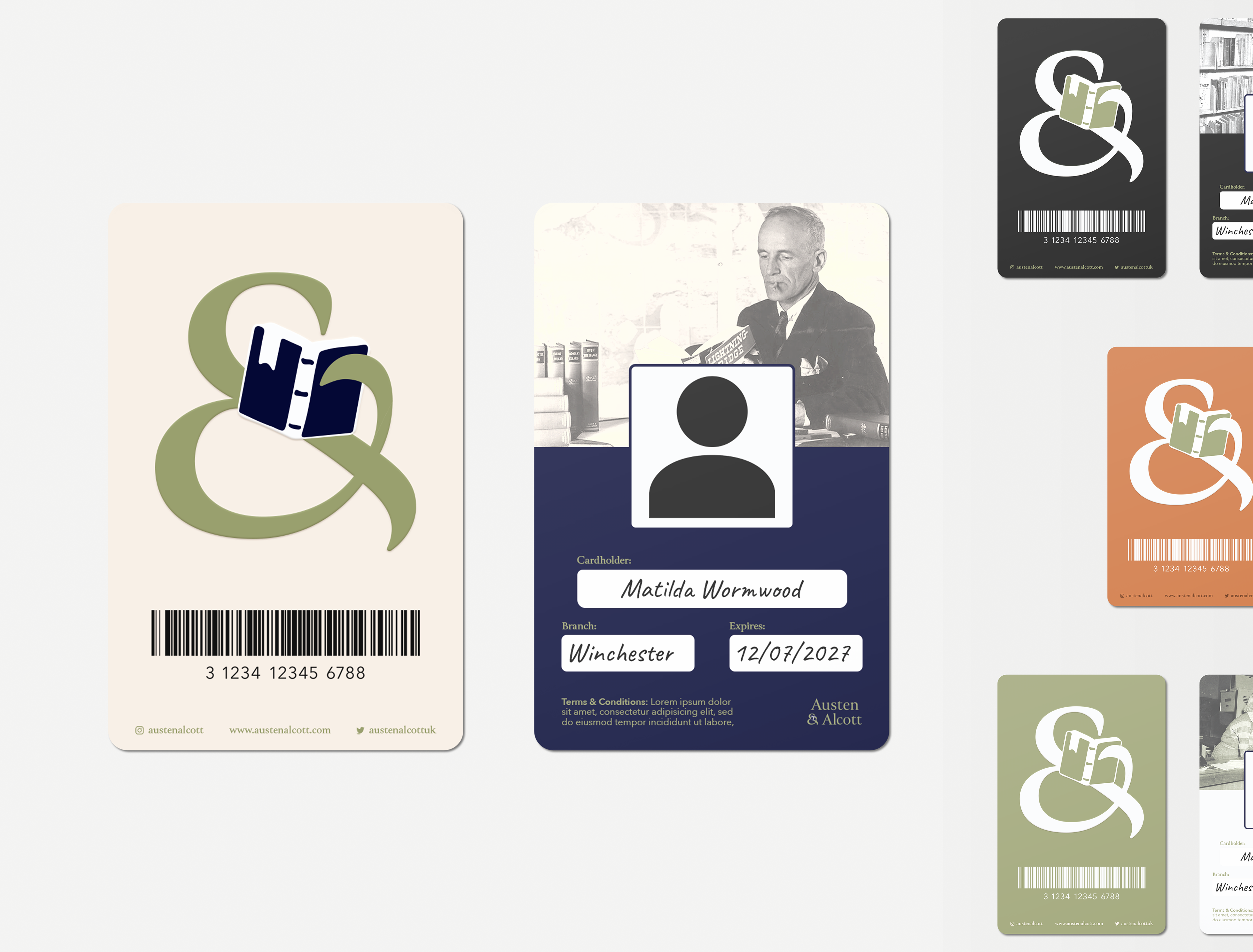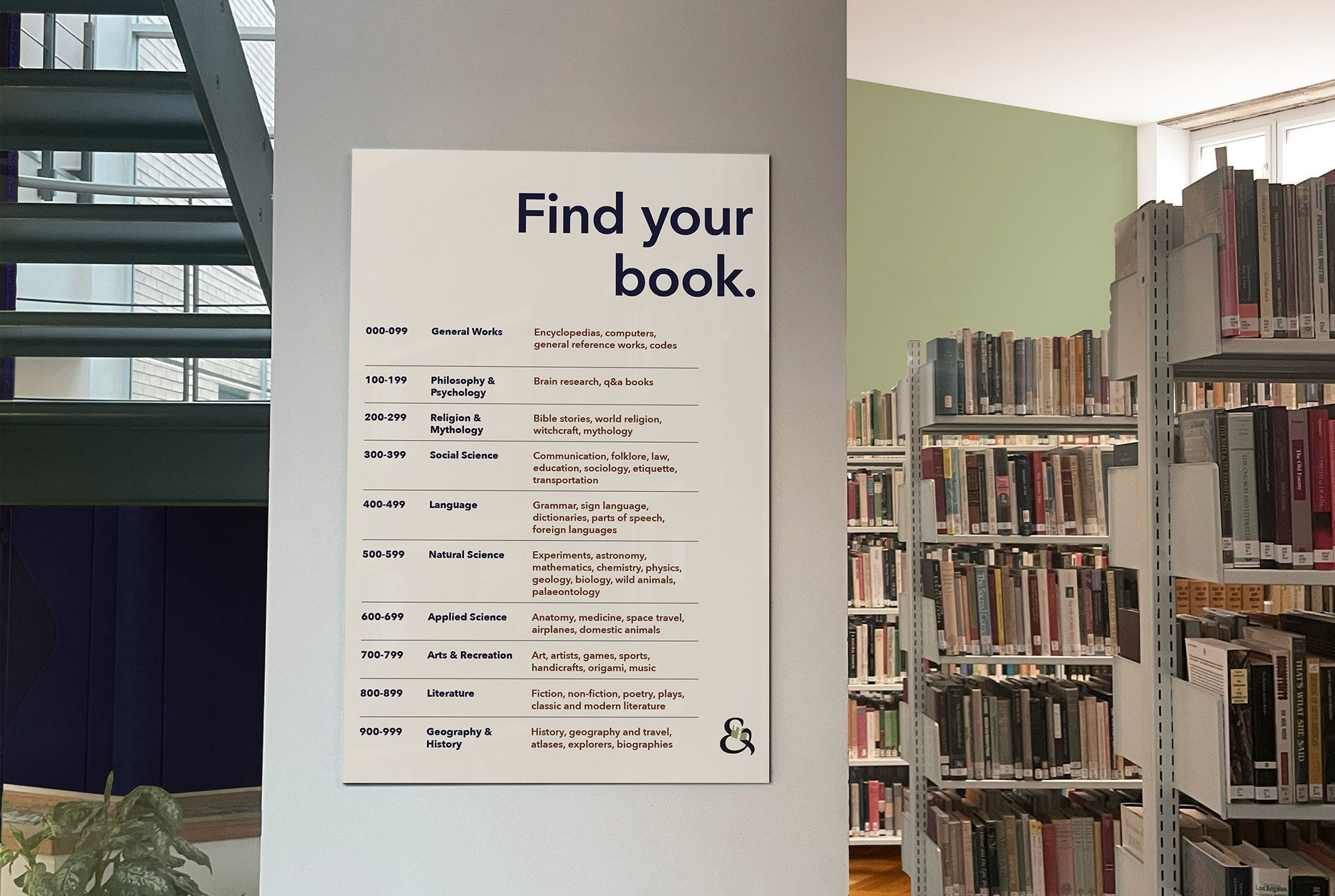


This is a personal rebranding project for library brand, Austen & Alcott, and a brief from IG's Brief Club. The main deliverables for this brief were the logo and the library card.
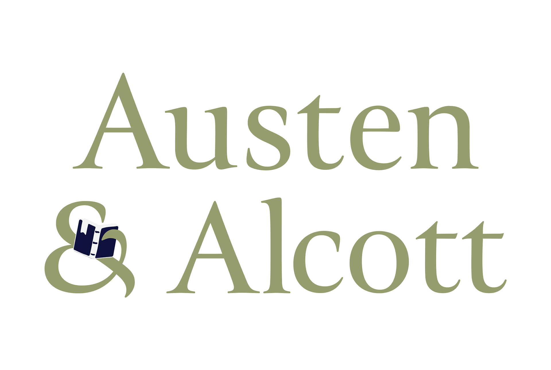
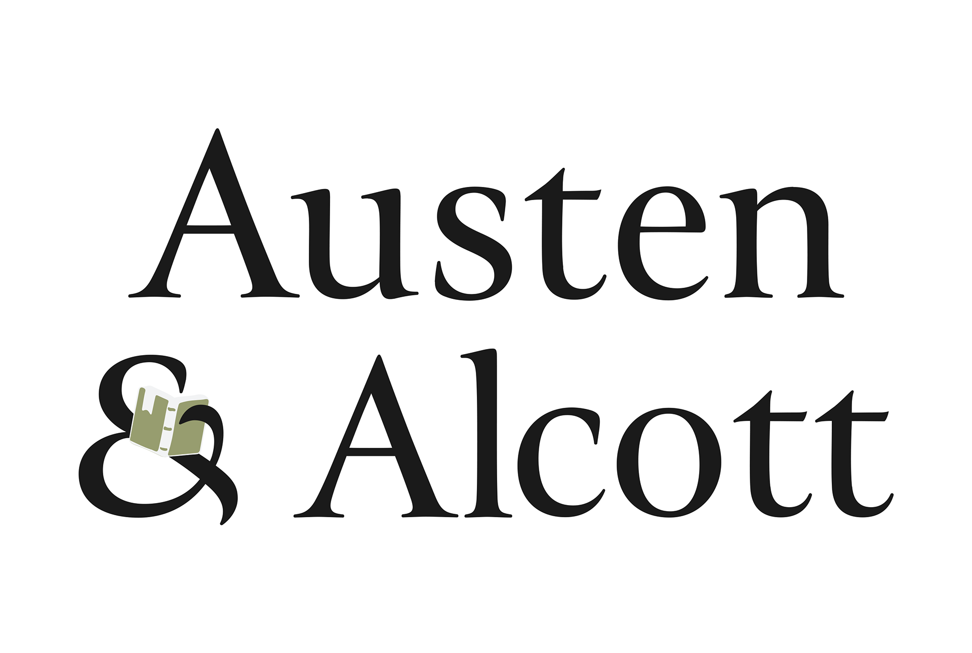
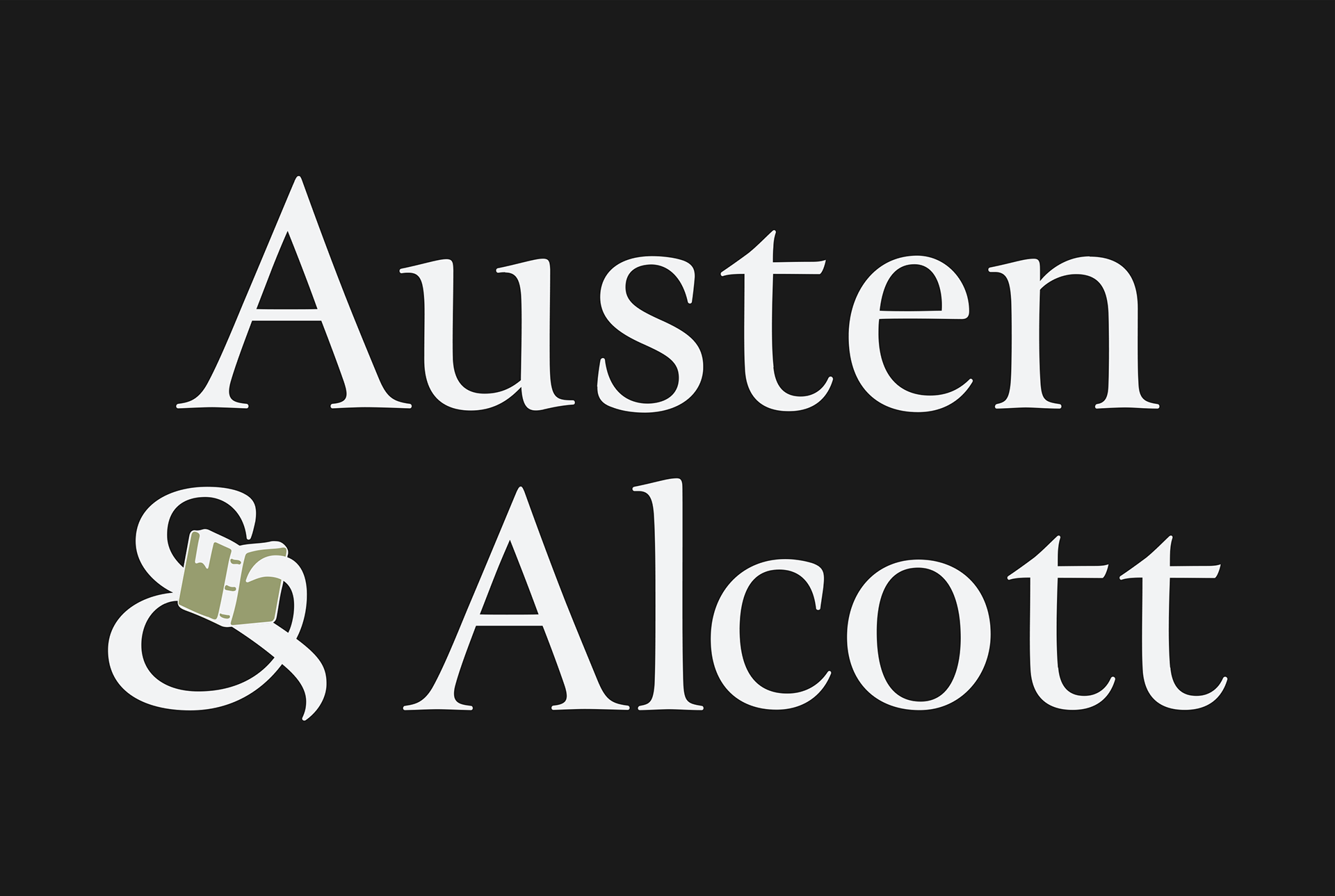
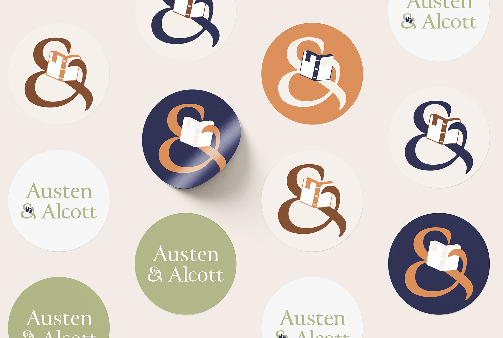
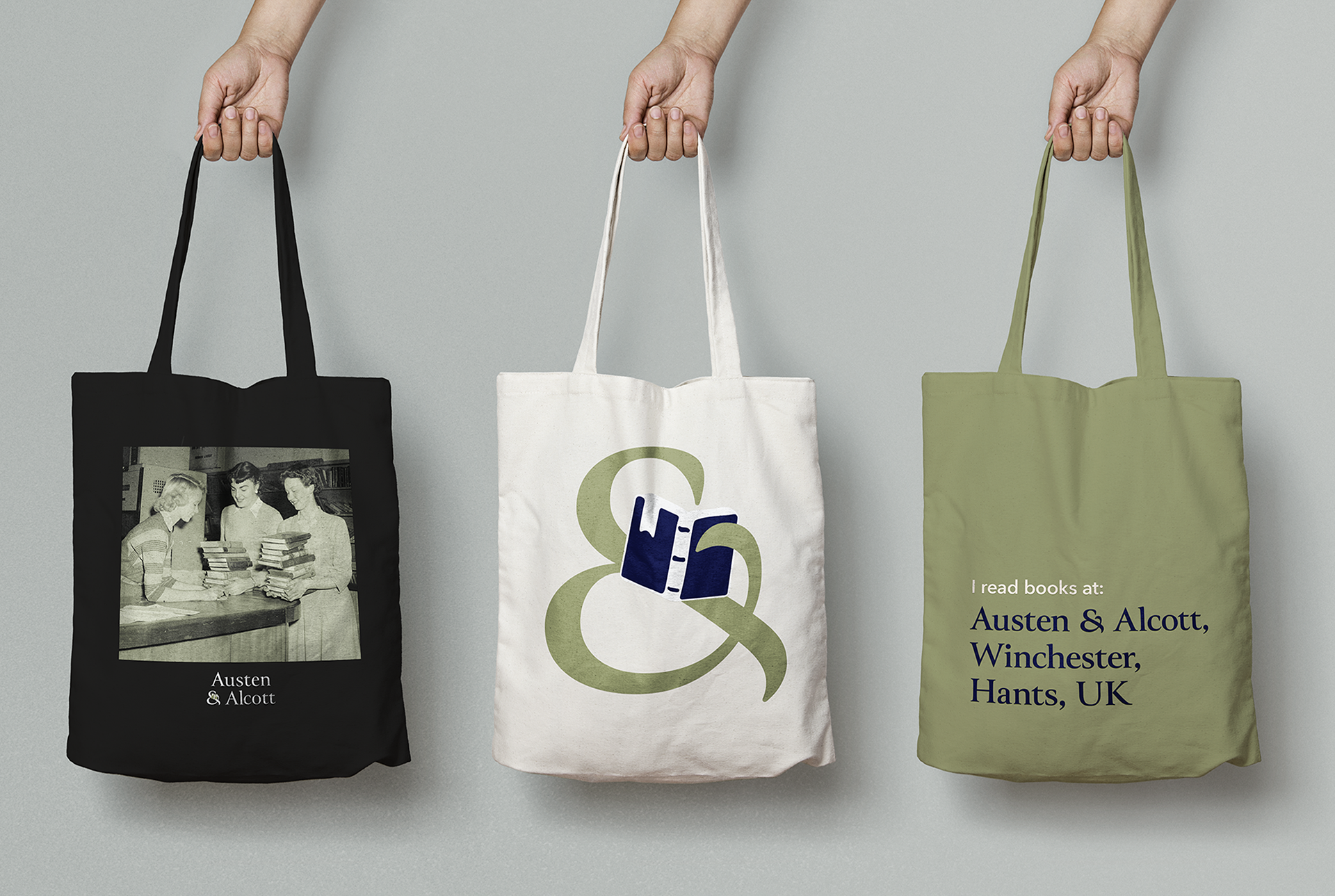
I played with the brand elements to create assets that conveyed the brand in a non-repetitive way. Tucking the book into the logo gives context, depth and distinctiveness, making it easier to use wherever possible as a standalone logomark. The triadic colour palate uses earthy colours, drawing inspiration from the natural smell of old books.
I built on this idea of legacy by using old-style images, featuring library workers and visitors from the past and adding a gradient overlay to align with the brand visuals. One of the library's core values is heritage which I wanted to convey within type. So I opted for the characterful and elegant Canto, which is a classic serif. I chose Avenir Next as a secondary typeface for increased legibility, plus it's roundness adds contrast.